This post contains affiliate links.
There’s a moment in every artist’s journey—a turning point—where hues on a palette transform into a language of emotion, a symphony of light and shadow painted across a silent canvas. Your heart beats a little faster as you dab your brush into the acrylics; eyes alight with anticipation, ready to conjure the vibrancy of life onto the once blank space before you. As a lover of color, you know that acrylic painting tips are worth their weight in gold, for they are the lore that helps you weave vibrancy into the visual stories you tell.
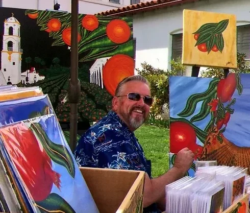
Vibrant Acrylics painting
The journey to achieving brilliant color combinations and understanding the depths of acrylic color theory is fraught with trials, enriched by errors, and ultimately triumphant with expertise gleaned from countless strokes of ingenuity. Allow me to guide you through color mixing techniques that are not merely ancillary skills but the very foundation upon which your visions come to life. Tips for mixing acrylic paints are rife with nuances, but when you master them, you don’t just achieve vibrant results, you ignite the canvas with your soul’s unique fire.
Dive with me into the realms where pigments dance and brilliance is birthed through purposeful strokes. Together, let’s unlock those time-honored acrylic paint mixing secrets and greet the vibrant possibilities that lie just beneath the surface.
Key Takeaways
- Discover the importance of color theory and how it shapes the dynamism in your artwork.
- Learn why traditional white paint might not always be your ally in achieving vibrancy.
- Uncover the power of layering colors to create depth without desaturation.
- Absorb practical tips that can turn the commonplace into the extraordinary with the right color mixes.
- Master the control of color vibrancy and saturation for confident, impactful acrylic painting.
- Explore courses that provide structured learning paths to enhance your color mixing prowess.
The Common Mistake Diminishing Acrylic Vibrancy
As you dive into the world of acrylics, you’re bound to be seduced by the promise of vibrant colors. Yet, there’s a pitfall that ensnares many—a trap laid by the very tools designed to bring your art to life. Let’s peel back the layers of this common conundrum.
Understanding Acrylic Paint Characteristics
Before you can unlock the Color Mixing Secrets for Acrylic Artists, it pays to know your medium. Acrylic paints, like those from Amsterdam by Royal Talens, offer a gateway into painting with their affordability and ease of use. Notice how they lend a certain softness and translucency to your canvas? It’s a unique feature that, ironically, can tempt you to reach for the white.
Avoiding Overuse of White to Maintain Saturation
But wait! Before you add that dollop of white, consider this: white may increase opacity, but it also dilutes the very soul of your colors, leaving them cold, chalky, and far from the vibrant results you’re after. Picture this: two paintings of peaches, one where white has crept into the mix, another relying solely on the hues’ pure intensity. Which do you think radiates vibrancy?
Here’s a tip worth painting into the corners of your memory: Reserve white for the final flourish, the highlights, the subtle effects that dance in the light. Embrace the translucency of acrylics for a depth that whispers secrets of shadows and volume. Yes, even in the quest for opaqueness, going layer by layer can reveal a depth you never knew existed, proving that, sometimes, patience paints the brightest picture.
Remember, your mission is to achieve vibrant results—and this mission, should you choose to accept it, involves mastering the very Acrylic paint mixing secrets that avoid the overuse of white. Follow these Acrylic painting tips, and your art will stand out, not with the volume of colors used, but with the depth and vibrancy of each stroke. Keep this in mind, and watch as your paintings come to life, one layer at a time.
Color Mixing Secrets for Acrylic Artists: Achieve Vibrant Results
Picture this: You’re poised before your canvas, your palette a spectrum of potential. The key to turning this potential into eye-catching reality? Strategic color layering and placement. Yes, mastering the transformative power of color mixing techniques can elevate your acrylic paintings from simply nice to spectacularly vivid.
The Benefits of Layering Colors
Think of layering as your artistic superpower. It allows you to build depth, complexity, and a certain je ne sais quoi that can only come from a rich, meticulously crafted painting. Here’s the deal: each subsequent layer refracts the light differently, interacting with the layers beneath it to bring out the acrylic paint mixing secrets that give your work a professional sheen. You’ll discover how to achieve vibrant results that are as lively as they are nuanced. But don’t just slap on paint willy-nilly—be thoughtful, be deliberate, be the artist who knows their craft.

Strategic Color Placement in Acrylic Painting
Whereto your brush next? Strategic color placement is the map by which you navigate the vast sea of hues. Venture beyond the comfort of familiar territory to mix your own colors on the canvas. Unearth the earthy greens, the riotous oranges, the regal violets by direct application or on-canvas blending, each a secret to achieve the vibrancy you crave. And remember, like a good chess player, always look a few moves ahead. Anticipate how colors will interact and set the stage for a stunning visual narrative.
| Technique | Visual Effect | Tips for Application |
|---|---|---|
| Direct Layering | Increased depth and texture | Apply thin, transparent layers and allow each to dry. |
| On-Canvas Mixing | Smooth gradients and transitions | Work quickly before paint dries, blending with care. |
| Complementary Underpainting | Dynamic color contrasts | Start with an opposite hue as a base to enrich the final color. |
Armed with these acrylic paint mixing secrets, tips for mixing acrylic paints, and a dash of your inherent flair, you are now ready to start your next masterpiece. Go forth, bold artist, and let your palette be as vibrant as your imagination!
Demystifying Acrylic Color Theory for Artists
Unlock the secrets of vibrant acrylics with a touch of color theory enlightenment. You’ve probably mixed red, yellow, and blue, expecting a kaleidoscope, only to end up with muddy puddles. Why settle for dull when you can mix like a maestro? Let’s dive into the world of acrylic color theory and discover how to get those mixes singing with radiance!
Primary Colors and Their Role in Mixtures
Red, yellow, and blue – the traditional primary heroes in color theory. But you’re no traditional artist, are you? The catch here is, while it’s fundamental to start here, stepping off the beaten path can lead to new horizons. Consider swapping out conventional primaries with their cooler, more glamorous cousins like Turquoise Blue or Quinacridone Magenta, and watch the mixing magic unfold.
In your alchemy of color mixing, these substitutions can summon secondary colors with a pop that just doesn’t happen with the regular crew. By keeping Primary Yellow steadfast in your mix, you’re setting the stage for a secondary color explosion that mirrors the vibrancy you envision in your mind’s eye.
Secondary Colors: The Building Blocks of Complexity
When primary colors shake hands and mingle, they give birth to secondary colors, the cornerstone of complexity in your palette. But this is not just about mixing one with another; it’s about the right mixture. The ideal dance of hues where every tint and shade has its place in the acrylic color spectrum.
| Mixing Combination | Resulting Secondary Color | Result with Traditional Primaries | Result with Vivid Primaries |
|---|---|---|---|
| Turquoise Blue + Primary Yellow | Lively Green | Muted Green | Vibrant Green |
| Quinacridone Magenta + Primary Yellow | Rich Orange | Muddy Orange | Bright Orange |
| Quinacridone Magenta + Turquoise Blue | Deep Violet | Dull Violet | Intense Violet |
So there you have it, a brief tour through the kaleidoscopic world of acrylic color theory. With these tips for mixing acrylic paints and color mixing techniques, you’re well on your way to a more vibrant palette. Remember, bold choices in your primaries can lead to secondary shades that sing off the canvas. Embrace the theory, experiment with gusto, and paint the town every shade of stunning.
Practical Acrylic Painting Tips for Luminous Shades
Ever found yourself staring at your canvas, wondering why your colors seem lifeless? Let’s talk acrylic painting tips – because, my friend, it’s time to bring some vibrance to that palate of yours. Let’s get your acrylic adventure popping with shades that scream “Look at me!”
First off, remember this: a dollop of Titanium White or a dash of Fluorescent Pink can work miracles. It’s like adding that pinch of salt in your cookies—transforms the whole deal. And Fluorescent Pink? Oh, that’s your secret weapon. A little stir into a mundane mix and – BAM! Vibrancy level: 100. Imagine that color practically leaping off the canvas.
Now, before you go reaching for that black paint to darken your tones, halt! Let’s be smart about this; we don’t want any muddiness crashing our color party. Instead, introduce some suave Prussian Blue into the mix. Darkness descends, but it’s crisp, it’s clear – it’s like adding shades to your color scheme. Judicious use of this dark hero keeps your colors dashing and debonair, without the grunge.

And here’s a pro tip on creating those much sought-after vibrant color combinations. Think less about the pot of gold at the end of the rainbow, and more about the way colors converse with each other. Painting is a dialogue. But, don’t just take it from me. Take a look at this:
- Layer, don’t muddy: Build color by layering, not by mixing them into oblivion. Treat each layer like a whisper, adding complexity to your color story.
- Contrast is your friend: Side by side, opposites on the color wheel really sing. Your oranges will look more orange next to a splash of blue. It’s a thing – trust the process.
- The transparent tease: Play with transparency for depth that doesn’t dominate. It’s seductive, it’s sophisticated – it’s acrylics done right.
Ready to up your game with tips for mixing acrylic paints? Remember what we learned today. Small additions for big impact, shying away from dulling agents (sorry, black), and letting colors have a heartfelt chat on your canvas. Go forth – make those colors dance!
Curating Your Unique Acrylic Color Palette
As an artist, your palette is your personal symphony, each color a note to be played in harmony. And just like a maestro knows the secrets to a captivating performance, Color Mixing Secrets for Acrylic Artists whisper to you the secrets of curating a palette that sings with vibrant color combinations. Let’s unravel these acrylic paint mixing secrets together, shall we?
Choosing Your Base: Picking a Color Bias
Begin by selecting your base color—a pivotal step in shaping the mood of your artwork. Ever considered the color bias? Yes, colors have biases too! Opt for a warm or cool lean within your primary colors to set the stage for vibrancy or suggest a soft whisper of hue within your masterpiece. Your choice here is fundamental; it speaks volumes about the visual dialogue you’re aspiring to create.
Adjusting Hue and Vibrancy with Complementary Colors
Nudge those hues and tweak that vibrancy—complementary colors are your magic wands. Dial up the intensity or tone it down; it’s your command that shapes their dance. Incorporate them wisely to achieve the naturalism or the punch that your artwork craves. In the grand scheme of your palette, these complements are not just your collaborators, they’re your allies in the quest for eye-catching vibrancy.
Remember, your palette is more than a collection of colors—it’s the fingerprint of your artistic voice, a resonant chord in the anthem of your creative expression. Follow these acrylic paint mixing secrets and watch as your vibrant color combinations take the stage, singing your unique vision into life.
Refining Your Acrylic Shades: Tips for Mastering Hues
As you delve deeper into the world of acrylics, you’ll find that mastering hues is akin to conducting a symphony; each shade you mix is a note that contributes to a harmonious outcome. Ready to refine your artist’s ear, or rather, your painter’s eye? Let’s enhance those shadows and deepen your shades without muddying the waters of your canvas.
Enhancing Shadows Without Muddiness
Trade in the muddiness for some moody, transparent layers. By opting for shadows with a touch of magenta, ultramarine, and burnt Sienna, you’re not just deepening the view; you’re adding a whisper of mystery to your art. These transparent colors are your secret agents in the world of color mixing techniques, working undercover to provide depth without dirtying the overall look. Remember, like a good whisper, it’s all about how you layer these tones.
Creating Depth with Glazing Techniques
Achieving the look of oil paints with acrylics is not just a dream, and glazing is your magic wand. By glazing thin, transparent colors over one another, you allow each to shine through, creating complex and visually vibrant results. It’s like having glasses for the first time—suddenly everything has more depth, and your painting comes to life. Start with just a dab, let it dry, and repeat – patience is your new best friend in this game of glazes.
With these acrylic painting tips, you’re on the path to mastering hues that evoke emotions and captivate the viewer. Remember, it’s not just about making a mark on the canvas, it’s about making an impression that lasts.
Vibrant Color Combinations and Their Impact in Art
As you delve deeper into the world of acrylic painting, embracing vibrant color combinations delves beyond aesthetic appeal—it’s about creating a visual symphony that resonates on an emotional level. The judicious use of contrast and color can turn your canvas from a silent sketch into a roaring masterpiece!
Utilizing Contrast for Visual Interest
Imagine a sunset without the fiery clash of red against the cool blue sky—lackluster, right? That’s where contrast steps in. Your artwork comes alive when you place opposite hues in close proximity. This doesn’t just apply to colors but to opacities as well. A sheer wash of pigment next to a thick, opaque stroke can add layers of sophistication to your work. This dance between different tones and textures is what keeps eyes glued to your canvas, wondering, how does it all come together so beautifully?

Optical Color Mixing: A Technique for Dynamic Results
You don’t always need to mix your paints on the palette to achieve the perfect shade. Optical color mixing is the alchemy that occurs when you let your audience’s eyes do the blending. This technique—where dots, lines, or other shapes of pure color are placed side by side—allows different colors to be perceived together, creating a vibrant effect that’s dynamic and full of life. It’s one of those intriguing acrylic paint mixing secrets that can become your signature style.
| Technique | Purpose | Impact |
|---|---|---|
| Contrast | To create focal points and depth | Draws the viewer in with striking visual paths |
| Texture Variation | To add complexity and interest | Enhances the sensory experience of the artwork |
| Optical Color Mixing | To achieve vibrant colors without palette mixing | Creates an engaging and interactive viewing experience |
When you understand and apply these principles of color mixing techniques, your artwork does more than please the eye—it becomes a dynamic conversation piece. So go ahead, mix with purpose and paint with passion. Your canvas is waiting!
Navigating Color Mixing Challenges and Solutions
Picture yourself in front of a vivacious canvas, the rich, creamy acrylics beckoning you into a world of color. But as you immerse yourself in the process, you find that some hues just aren’t playing nice. Fear not, dear artist, for you’re about to unlock the secrets to overcoming these pigment puzzles and achieving luminous results every time.
Creating a stunning palette with acrylic color theory isn’t about randomly smashing colors together; it’s a harmonious blend of science and intuition. Let’s dissect this, shall we? When it comes to dark colors, think of them as the potent spices of your palette – a pinch too much and your mixture is overwhelmed. Opt for earthy browns or deep blues to add depth instead. These can enrich your color mix without muddling the vibrancy you crave.
And while we revel in the kaleidoscope of shades, remember to introduce each pigment cautiously. Color mixing techniques are like a culinary art; a drop too much and you shift the entire balance. Begin with your lightest colors and gradually whisk in the darker tones, watching as they meld into the perfect acrylic concoction. Here’s a whimsical tip: pretend you’re at a high-stakes poker game – hold your darkest cards close until the end, revealing them only when necessary.
- Start with transparent pigments to maintain an inherent glow
- Introduce darker shades sparingly for contrast and depth
- Remember the impact of lighting – what looks good under your studio bulbs may sing a different tune in daylight
Now, let’s play a little game of ‘What if?’. What if you’re striving for an elusive hue and your mix resembles murky swamp water rather than the clear sky at dusk? This calls for a strategic retreat to your palette. Arrange your paints like soldiers on the battlefield, primaries at the forefront, flanked by their trusty allies, the secondary colors. With this setup, you’ll have a bird’s-eye view of your color strategy, and victory will be within your grasp.
“Acrylic painting tips are not just steps; they are whispers from the canvases of those who painted before us.” – Heartfelt Advice from a Seasoned Artist
Embrace these nuggets of wisdom, and you’ll watch as your acrylics dance across the canvas in a vibrant display of artistic prowess.
Streamlining Your Acrylic Palette for Better Blends
Let’s dive into the art of maintaining a pristine palette to ensure each of your brushstrokes is a symphony of color. You know the drill: cleanliness equals clarity. But how do we get there, you ask? With acrylics, staying orderly isn’t just about neatness – it’s about the brilliance of hues, the perfection of your mix, and the dialogue between your vision and what unfolds on your canvas. So emblazon some painterly wisdom into your artistic endeavors and let’s talk about keeping our palettes as fresh as our ideas.
Cleaning Techniques to Preserve Color Purity
Imagine a mixing pot where colors don’t get muddled; that’s your palette. It’s the hub where Tips for mixing acrylic paints become tangible results. Start with the basics: wipe away the remnants of past projects. A clean slate fosters untainted possibilities. When mixing, use a separate mixing spot for each color to prevent crossover, and clean your brushes religiously. Remember, the introduction of unintended specks of color could be the nemesis of your intended hue.
Palette Layout Strategies for Efficient Mixing
Consider the Acrylic painting tips equivalent of mise en place: layout. Arrange your colors systematically, be it by tonal order or mirroring the color wheel’s harmony. Organized layout means efficient mixing and an intuitive workflow that feels less like guesswork and more like second nature. And here’s an insider’s trick: transparent colors should sashay into your mix with a delicate hand, as they’re easily engulfed by their opaque counterparts.
Palette Arrangement Table: A guide to keep your colors performing at their peak.
| Color Type | Placement | Usage Tip |
|---|---|---|
| Primaries | Core spots for easy access | Start mixes with primary colors |
| Secondaries | Next to their primary parents | Mix only as needed to maintain vibrancy |
| Tertiary & Neutrals | At the periphery | Use sparingly to adjust tones |
| Opaque | Grouped together | Add last to control saturation |
| Transparent | Separated space | Add first to gauge vibrancy |
The palette is the underpinning of those Color Mixing Secrets for Acrylic Artists you’ve been honing. With it finely tuned, each dab of your brush is an opportunity to create the harmonious symphony you envisage. No cacophonies of colors, no discordant strokes – just pure, vibrant blends that sing under your deft hands. So, paint on, artists, and let your palette be as coordinated as your vision!
Conclusion
As you traverse the vivid landscape of your acrylic endeavors, the secret compass guiding your artistic success lies in grasping the nuances of color and its endless potential. Unearth the bounty of vibrancy as you master Acrylic color theory, a quest that not only enriches your palette but transforms mere dabs of pigment into an intricate dance of light and expression. The road to creating stunning visuals is paved with novelties, such as bypassing common inclinations to dull a painting’s heartbeat with unnecessary whites, and instead, choosing to treat your brushes to the delicate art of mixing colors with precision.
Your palette is not just a tool; it’s a playground for discovery. As you unlock vibrant color combinations and foster a keen understanding of acrylic painting tips, each layer you apply becomes a narrative of shades, each stroke a chapter of chromatic brilliance. By integrating color mixing techniques that resist muddiness and celebrate clarity, the results you’ll achieve will be nothing short of astounding—layers that sing, hues that speak, and blends that truly embody the essence of the scenery you wish to convey.
In the end, it’s the bold embrace of these acrylic paint mixing secrets that ushers you into the league of artists whose works not simply capture gazes but engage souls. So dip your brush with confidence and let the canvas be your arena where every mix, every blend, and every contrast coalesce to achieve vibrant results—an art that resonates as much with your bold spirit as it does with the admirers of your craft.
FAQ
What’s the biggest mistake artists make when trying to achieve vibrant acrylic colors?
The common pitfall is the overuse of white paint, which leads to desaturation of colors and a diminished vibrancy. Instead, try embracing the paint’s natural transparency and layering to maintain rich, vivid colors.
How can I enhance the vibrancy of my acrylics without making them look chalky?
Rather than adding white, use the colors in their purest form or mix them on your canvas, employing strategic layering to build up the intensity and depth without compromising vibrancy.
What’s a good rule of thumb for creating natural-looking colors?
Mixing your own colors for organic shades like oranges, greens, and violets is the way to go. It gives you more control over transparency and helps avoid a muted finish.
Can you suggest non-traditional primary colors for more vivid secondary colors?
Absolutely! Swap out the classic primary colors with something like Turquoise Blue and Quinacridone Magenta, while keeping Primary Yellow to mix up some show-stopping secondary hues.
Are there any tips for making acrylic shades appear more luminous?
Yes! A slight touch of Titanium White can enhance brightness and for a vibrancy kick, try adding a dash of Fluorescent Pink. Also, use darker colors like Prussian Blue instead of black to deepen tones without muddying the mix.
How do I choose complementary colors to adjust hue and vibrancy?
Select a base color with the desired color bias and then integrate its complement to fine-tune the hue. This can help you achieve a more natural look and increase appeal in your color combinations.
What technique can deepen shadows in my acrylic paintings while retaining clarity?
Glazing with transparent colors such as magenta or ultramarine can enrich your shadows without causing the muddiness that’s often associated with the excessive use of dark paints or black.
How can I add visual interest and dimensionality to my paintings?
Optical color mixing is your friend! Place contrasting tones and varying opacities side by side to create vibrant effects that catch the eye and add depth to your artwork.
When mixing colors, how can I avoid creating a dull result?
Know your pigments! Darker colors can dominate a mix, so use sparingly and never rush to black. Consider dark browns or blues for shading and add transparent pigments incrementally to maintain their radiance.
What’s a smart palette layout strategy for efficient mixing?
Organize your palette in a color wheel sequence or tonal order to quickly find the colors you need. Keep those brushes clean to ensure no muddy surprises during your color mixing adventures.
Source Links
- https://www.ettavee.com/blog/vibrant-color-mixing-with-acrylic-paint
- https://www.malcolmdeweyfineart.com/blog/how-to-get-vibrant-acrylic-colors-in-your-painting-every-time
- https://www.artistsandillustrators.co.uk/how-to/art-theory/top-colour-mixing-tips/
This post contains affiliate links.