This post contains affiliate links.
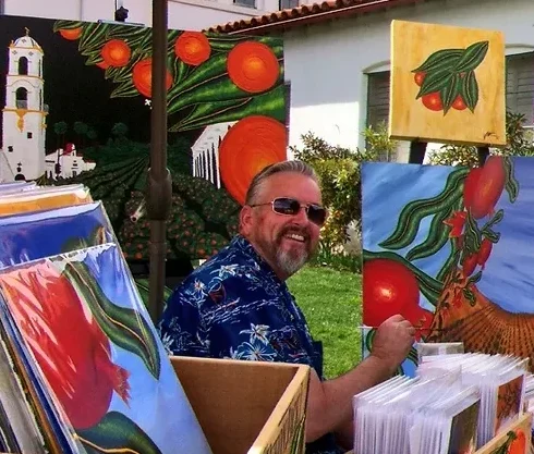
Remember the thrill of opening your first box of crayons? Those vibrant hues were a passport to an imaginary realm, a space where only your creativity dictated the rules. This nostalgia is a beloved shared experience we carry into adulthood, but the playground has evolved. Now, it’s a canvas, and your palette awaits with untapped potential. Embrace the magic of mixing acrylics, and let this Beginner’s Guide be your mentor as you craft a spectrum as unique as your aspirations. Whether you’re bent over your kitchen table amidst DIY art projects or settled into your studio, preparing for a masterpiece, understanding how to blend acrylic paint is the cornerstone of bringing your artistic visions to life.
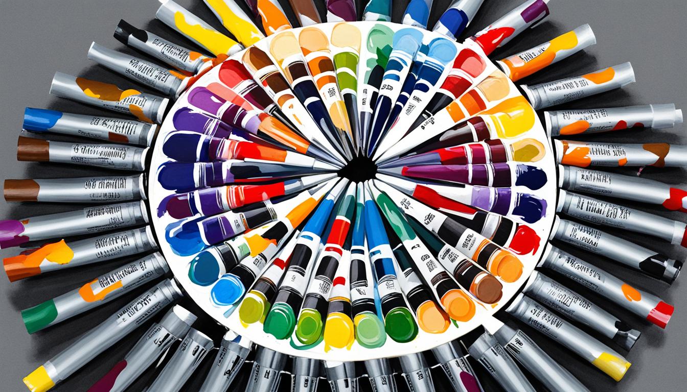
Building your foundation star with a crucial inventory: your art supplies for beginners. They don’t just carry colors; they carry possibilities. Within each tube of paint whispers the secret of creating custom colors, a whisper that this acrylic painting tutorial promises to amplify into a shout. You’re not just an artist; you’re an alchemist turning the base metals of primary colors into the gold of a sunset only you can imagine. So ready your brushes—adventure into the alchemy of hues with our strategic color mixing techniques and bring that imaginary realm to your canvas, one blend at a time.
Key Takeaways
- Understand the essentials of a beginner’s palette for successful color mixing.
- Discover how primary, secondary, and tertiary colors interact on the canvas.
- Learn the techniques to create an infinite array of custom hues.
- Grasp how blending and temperature of colors can transform your artwork.
- Equip yourself with both the tangible and intangible tools for acrylic painting success.
An Introduction to the Color Wheel and Basic Color Theory
When you venture into the realm of painting, one of your trustiest sidekicks is the Color Wheel, an easy-to-use visual representation of colors arranged according to their chromatic relationship. Think of the Color Wheel as your compass in the vast sea of color possibilities, helping you navigate the Basic Color Theory with ease. Let’s set sail and unravel the mysteries of colors and how they relate to one another.
The Role of Primary Colors in Custom Mixes
Meet the Color Wheel VIPs: the Primary Colors—red, yellow, and blue. These guys are like the rock stars of color: bold, independent, and impossible to create by mixing other colors. When it comes to custom mixes, they’re your starting trio, the foundational pigments on which you’ll build your masterpiece.
Without Primary Colors, dear artists, you’re virtually colorless; with them, a universe of hues await your command.
Secondary and Tertiary Colors: Expanding Your Palette
Now that you know who the true leaders of the color world are, let’s introduce their offspring—the Secondary and Tertiary Colors. Mixing two primaries gives you a Secondary Color that’s eager to join your palette. A whole new dimension unfolds when these secondary shades meet their primary parents or even another secondary color, revealing the Tertiary Colors. Ready to expand your palette even more?
| Primary Color #1 | Primary Color #2 | Resulting Secondary Color |
|---|---|---|
| Red | Yellow | Orange |
| Yellow | Blue | Green |
| Blue | Red | Purple |
Interpreting Complementary, Analogous, and Neutral Colors
When you think you’ve seen all the colors, the plot thickens with Complementary and Analogous Colors galore. Complementary colors are the Color Wheel’s drama queens, located across from each other, they demand attention as they sing in perfect contrast. Analogous colors, on the other hand, are like harmonious neighbors, side by side on the wheel, providing a visually soothing and cohesive experience. But don’t forget about the Neutral Hues, those versatile shades born from combinations that earthy, understated look every sophisticated palette needs.
Remember, the magic is in the mix: Primary Colors open up a world of hues, Palette Expansion happens as you explore, and in the dance of Complementary Colors and Analogous Colors, you find the rhythm of your painting coming to life. Whether you’re after vibrant contrast or calm cohesiveness, it’s all in your hands—or should we say, on your palette?
Essential Art Supplies for Beginners
Ready to dive into the colorful world of Beginner’s Acrylic Painting? Before you can channel your inner Van Gogh, let’s stock up on some painting essentials. As you’re standing in the art store aisle, remember, a true artist is only as good as their tools—well, that and a dash of talent and a smidge of practice.
First things first, grab those Acrylic Paints. You’ll want a variety of hues, but it’s not just about snatching every color off the shelf. Focus on a balance of warm and cool versions of each primary color—this isn’t just color theory razzle-dazzle; it’s your secret weapon in the vast world of shades.
- Warm and cool hues of red, yellow, and blue
- Titanium White – because mixing is an art and white is your canvas
- A selection of earthy greens – because who has time to mix foliage shades every time?
| Color | Type | Temperature | Perfect for |
|---|---|---|---|
| Ultramarine Blue | Primary | Warm | Deep Oceans and Night Skies |
| Pthalo Blue | Primary | Cool | Lush Vegetation and Vibrant Skies |
| Cadmium Red | Primary | Warm | Fiery Sunsets and Dramatic Accents |
| Alizarin Crimson | Primary | Cool | Rich Portraits and Wine Grapes |
| Lemon Yellow | Primary | Cool | Zesty Lemons and Subtle Highlights |
| Cadmium Yellow | Primary | Warm | Sunflowers and Warm Light |
Now, you might be thinking, “That’s great, but what about my brushes?” Oh, fellow artist, worry not! You’ll want a variety of shapes and sizes so you can dab, stroke, and stipple to your heart’s content. Start with a few basics:
- Flat brushes for bold, sweeping strokes
- Round brushes for detailed work and lines
- Filbert brushes for blending and soft edges
- Fan brushes for textures and smoothing
And don’t forget your palette! A sturdy surface for mixing those vibrant acrylic paints is a must-have in your Art Supplies for Beginners. Lastly, do yourself a solid and throw in an easel—it helps with perspective and keeps your masterpiece-in-progress at eye level.
Now that you’re equipped and primed, go forth and conquer that canvas. Your beginner’s toolkit is complete, and your acrylic painting journey awaits!
Mixing Acrylics: A Beginner’s Guide to Creating Custom Colors
Embarking on the voyage of color mixing in acrylic painting can seem like deciphering a cryptic prism. But fear not, as you’re about to learn the secrets of Selecting Hues and mastering the dance between Warm Tones and Cool Tones. The magic unfolds when you understand the nuances of Color Mixing and How to Blend Acrylic Paint to achieve that perfect shade you’ve been dreaming of.
Tips for Selecting the Right Hues for Your Project
Choosing hues is akin to picking chess pieces for a strategic play. The right move can culminate in a checkmate of visual pleasure. Whether you’re aiming for a fiery sunset or the tranquil depth of a starry night, every choice matters. Let’s consider this: the fiery charm of crimson red has the audacity to warm up any canvas, while a splash of cobalt blue infuses a breath of cool mystery.

Understanding Warm vs. Cool Tones in Color Mixing
Ah, the eternal struggle between warmth and coolness. Let’s dissect this, shall we? Warm tones will leap from your canvas, whispering tales of sunny days and cozy moments. They often feature undertones of reds and yellows—think of warm amber. Cool tones, on the flip side, retreat, soothing your soul with memories of shady groves and glacial peaks. They carry secret notes of blues and greens. Manipulating these tones is the key to creating colors that sing.
| Warm Hues | Cool Hues |
|---|---|
| Cadmium Red | Alizarin Crimson |
| Yellow Ochre | Lemon Yellow |
| Ultramarine Blue | Phthalo Blue |
| Raw Sienna | Titanium White |
While shaping your pallete, remember that some colors are chameleons and can swing either warm or cool. A peek at the label will unravel this mystery—brands typically list pigment information that can guide your selection for the perfect blend. And for that deep, rich black? Wave goodbye to convenience tubes. Instead, invite the complementary shades to a mixing soiree where no white is allowed to dull the drama.
There you have it. You’re armed and ready to give life to the colors of your imagination. Let’s dip our brushes into the hues of possibilities and paint a world of our own making.
Color Mixing Techniques That Elevate Your Art
As you dive into the world of acrylic painting, you’ll find that blending acrylic paint is much like a dance – rhythmical, expressive, and perfectly timed to create a visual symphony on your canvas. With the right color mixing techniques, your art will not just capture the viewer’s gaze; it will hold it in awe. Let’s explore the steps to blend those transitions so smoothly, your audience will wonder how you conjured such magic.
Blending Acrylic Paint: Methods for Smooth Transitions
Mastering the art of blending acrylic paint is quintessential for achieving those dreamy, smooth transitions that give life and movement to your artwork. Start with soft brushes and a dampened canvas to allow the paint to glide effortlessly. Did you know that a dry brush technique can softly feather edges and merge colors seamlessly? Color mixing techniques aren’t just science; they’re your secret spices in the recipe of creating depth.
Creating Depth with Shades, Tints, and Tones
Creativity blooms when you play with shades, tints, and tones, the essential elements for adding drama and depth. Imagine the acrylic painting tips that advocate for a pinch of white here or a dash of red there as your acoustic guitar strumming the chords of visual impact. Use a palette knife for mixing and lay down a swatch – see the magic happen as hues transform right before your eyes.
| Base Color | To Lighten (Tint) | To Darken (Shade) | To Tone (Saturation) |
|---|---|---|---|
| Ultramarine Blue | Add White | Add Brown or Pthalo Green | Add Gray |
| Alizarin Crimson | Add White | Add Pthalo Green | Add a touch of complementary color |
| Cadmium Yellow | Add White | Add Deep Violet | Add a bit of its complementary color |
Remember, your art is your voice. With these acrylic painting tips, you’re not just creating images; you’re whispering stories to the canvas. So go ahead, layer those paints, and let every stroke sing a verse of your artistic tale.
How to Blend Acrylic Paint for Realistic Effects
Hey there, savvy artist! Ready to turn those flat looking figures into lifelike masterpieces? It’s all in the art of blending acrylic paint. This isn’t a simple mix and match; it’s the secret sauce to adding dimension and intensity to your work, pulling your audience into a more realistic experience.

Begin your quest for realism by crafting a solid brown base from your trusty primary colors. Remember, the party doesn’t stop at brown town; you’re heading over to the sophisticated suburbs of skin tones. Add a pinch more of one primary to tweak the shade, like sprinkling seasoning to perfection. But use white and black sparingly—think of them like a strong spice.
Layering shades is like building charisma for your characters, each brushstroke adding a slice of soul and shadow, carving out those cheekbones, and rounding off those muscles. Get daring with your darks by tossing a dash of red into your blues. Why? To keep your shadows singing with life, avoiding the dreary dungeon of flat black tones.
Perfect blending is like a dance, where hues and saturation find harmony, balance, and rhythm on your canvas.
Here’s a fun fact: Realistic Effects often rely on the subtle interplay of warmth and coolness in tones. And since your acrylic painting tutorial wouldn’t be complete without trying this at home, grab those brushes and make those strokes that mimic the gentle gradation of light on skin or the soft caress of a breeze on fabric.
Remember, patience is your ally. The best blended acrylic work doesn’t happen at the flick of a wand; it’s a symphony of carefully orchestrated strokes, layers, and colors that come together for that grand finale. Go ahead, give life to those strokes!
Acrylic Painting Tips: From the Palette to Canvas
As you embark on your creative journey with acrylics, understanding how paint viscosity and the interplay of opacity and transparency can elevate your artwork is essential. These factors are pivotal in adding life and dimension to your canvas, making your creative vision a tangible reality. Let’s delve into some advanced techniques that will help you manipulate these elements to your advantage.
Managing Paint Viscosity for Different Effects
When it comes to acrylic painting, the thickness of your paint—its viscosity—can have a dramatic impact on the outcome. To achieve textures that draw the viewer in, you’ll need to master the art of altering paint consistency. Acrylic mediums and water are your partners-in-crime here, allowing you to achieve everything from a thick impasto effect to a delicate watercolor wash.
Mixing Opacity and Transparency for Dimension
Playing with the mixing opacity and transparency gives your painting a depth that can’t be attained otherwise. Using titanium white to increase opacity maintains color purity and provides that pop of brightness needed for highlights and textured effects. Conversely, embracing transparency can lend ethereal qualities to layers, creating a sense of depth that is utterly captivating.
Now, let’s get a bit technical and dive into a table that will help you understand the results of manipulating paint viscosity:
| Paint Consistency | Technique | Effect on Painting |
|---|---|---|
| Thick (High Viscosity) | Impasto, Palette Knife | Adds texture and dimension |
| Medium | Brushwork | Ideal for general painting applications |
| Thin (Low Viscosity) | Washes, Glazing | Creates transparent layers and enhances depth |
| Very Thin | Dripping, Pouring | Results in fluid, spontaneous effects |
Remember to always mix shades slightly lighter than their intended appearance once dry, since acrylic paint has a darker dried color due to its inherent transparency. There you have it, your path to dynamic dimension in painting awaits—experiment with diligence and watch your artistry flourish.
DIY Art Projects: Practical Applications of Color Mixing
Hey there, creative soul! You’re about to embark on a color-filled journey with DIY art projects, where each brushstroke screams originality and flair. It’s here, within the bounds of your own imagination and the walls of your abode, that the power of practical color mixing truly shines. So roll up your sleeves, because it’s time to dive into the vibrant world of applying mixed colors and see your acrylic paint projects come to life.

Think of color mixing not just as an artistic endeavor but as an adventure where you’re the captain of the ship. You’ll learn to sail the high seas of hues, navigating through shades and tints, blending your way to undiscovered territories, reaching for that perfect sunset sky or the deepest of ocean blues.
Remember, when it comes to DIY art projects, your homemade palette is your best companion.
Now, let’s talk technique. A grid mixing chart is akin to a treasure map—it guides you in creating colors you never thought possible, with X marking the spot of that elusive perfect shade. Behold the chart:
| Base Color | Mix With | Resulting Color |
|---|---|---|
| Red | Yellow | Orange |
| Blue | Red | Purple |
| Yellow | Blue | Green |
| Red | White | Pink |
| Blue | Grey | Steel Blue |
| Yellow | Green | Lime Green |
But don’t just stop there! Mix, match, and meddle until you find your signature blend. After all, it’s not just about the colors you mix, but the magic you create with them. Ready to paint your world with the spectrum of your own design? Let applying mixed colors be your palette-knife, sculpting depth and emotion into every acrylic paint project that springs from your crafty hands.
So go on, make a splash in your artistry with hues made by you, for you. Happy mixing!
Acrylic Painting Tutorial: Step-by-Step Mixing Guide
Welcome fellow artist! Embrace the simplicity of starting with a limited palette in your acrylic painting journey. It’s like the minimalist lifestyle of painting – less clutter, more creativity. Who knew a few basic colors could unlock such a wide spectrum, right? Let’s dive into the vibrant world of pigments without overload.
Starting with a Limited Palette
You’re standing before your canvas with the Plaid Folk Art Set in hand—you savvy saver, you. It’s a treasure trove of potential waiting to be mixed. With your trusty primary colors, the door to an entire rainbow is ajar. And you’re about to fling it wide open. By blending these fundamental hues, you discover the first secret of expanding color possibilities: simplicity begets complexity.
Expanding Color Possibilities with a Few Key Tubes
Feeling adventurous? Good. With just a couple more tubes like Burnt Umber and Yellow Ocher, you’re not just mixing colors anymore; you’re an alchemist transmuting the mundane into the magnificent. Your limited palette blossoms with an array of new shades, introducing a symphony of subtlety to your collection.
| Basic Color | Burnt Umber Mix | Yellow Ocher Mix |
|---|---|---|
| Primary Blue | Navy Depths | Warm Sunrise |
| Primary Red | Earthy Rose | Spiced Coral |
| Primary Yellow | Golden Suede | Lush Lemonade |
Marvel at your newly expanded palette; a testament to the rich diversity you’ve achieved. And remember, these are just a sample of the many hues you can create. The acrylic painting tutorial you’ve embarked on is just the beginning—a canvas of color waiting for you to take that brushstroke.
Conclusion
Embarking on your artist journey has undoubtedly transformed your approach to acrylics, equipping you with a Custom Color Guide that’s both practical and inspiring. You’ve navigated the nuanced spectrum of the color wheel and become versed in the foundational aspects of color theory. Now, with a palette at your fingertips and a myriad of mixing techniques under your belt, the potential to achieve acrylic painting success is boundless. Reflect on how vividly a once-daunting array of colors has become an exciting playground for your imagination.
Your evolution to creating custom shades reflects your dedication to the craft—each stroke on the canvas is a testament to your growth. The application of ultimate painting tips gleaned from this guide ensures that your DIY art projects and canvas creations are imbued with vibrancy and depth, capturing the very essence of your artistic voice. Remember, it’s not just about the colors you paint but how you blend them into something uniquely yours—that’s where true artistry lies.
So, grab those brushes and let the spectrum of possibilities guide you. With every shade mixed and every technique honed, you are not just painting; you are embarking on an endlessly enriching path that resonates with your personal expression. Happy painting!
FAQ
What are the primary colors I need to start mixing my own acrylics?
Dive into the color festival with your essential buddies: red, yellow, and blue. These are your primary color pals that don’t play the mixing game – they’re the originals. Make friends with both the warm and cool versions for more color mixing parties.
How do I create secondary and tertiary colors from the primary ones?
Magic happens when two primaries crash the dance floor. Combine red and yellow for orange, blue and yellow for green, and red and blue for violet – those are your secondary colors. For the fun-loving tertiary colors, invite a primary and a secondary to tango, like red-orange or blue-green. Voila, more hues for the mood!
Can you explain complementary, analogous, and neutral colors for me?
Imagine the color wheel is a clock; the complementary colors are those directly opposite each other, like 6 o’clock and midnight. They might clash in theory but are a match in artistic heaven, creating greys and browns when combined. Analogous colors are the next-door neighbors, blending harmoniously. Neutrals? They’re your greys, blacks, and browns, born from mixing opposites or all three primary colors.
What are some essential supplies I need for beginning with acrylic painting?
Think of your art supplies as the starting blocks of your masterpiece marathon. Grab a basic set of acrylic paints, some resilient brushes, a sturdy canvas, a palette for mixing, and some mixing medium or water to keep the paints in a flowy mood. Don’t forget the cleanup crew – paper towels and water.
What’s the secret sauce for selecting the right hues for my acrylic painting project?
It’s like choosing the flavor of your ice cream – go for a concoction of both warm and cool variations of your primaries. Remember, your color-caliber can wildly alter the outcome. Red with a hint of yellow gives you a warm, sunset vibe, while a blue with a pinch of green feels like diving into the ocean.
How should I go about blending acrylic paint for those oh-so-smooth transitions?
The key to blending without bungling? A gentle hand and a dab of patience. Use a moistened brush and work quickly before your acrylic decides to dry up the conversation. Mix your shades on a palette, then dance the brush to create those buttery smooth transitions on the canvas.
How can I use shades, tints, and tones to add depth to my painting?
Think of your painting as a soap opera—drama all the way! Add depth by introducing shades (add some black) for those mysterious shadows, tints (hello, white) to bring forward the highlights, and tones (mix a little grey) to finetune the color’s intensity and add complexity.
What are some DIY art project ideas for experimenting with color mixing?
Let your inner DIY spirit loose—color mix your way into painted pots, groovy greeting cards, or custom T-shirts to flaunt your skills. These projects are not just about fun; they’re the real-world apps of your mad color mixing lab experiments.
How do I start acrylic painting with a limited palette?
Embrace simplicity, grasshopper. Begin with a minimalist set and explore the depths of each color’s personality, stretching them to their full potential. It’s like a cooking challenge—you’d be surprised what you can whip up with just a few ingredients.
Any tips for expanding my color possibilities with a few extra tubes?
To jump from color basic to guru level, grab some versatile champs like Burnt Sienna or Ultramarine. They’re like the wild cards in your color deck, unlocking new dimensions and enriching your palette. It’s all about making smart additions for that full spectrum dominance.
This post contains affiliate links.
[…] palette is not just a tool; it’s a playground for discovery. As you unlock vibrant color combinations and foster a keen understanding of acrylic painting tips, each layer you apply becomes a narrative […]
[…] medium – Think of your Acrylic Pouring Medium as your faithful steed, ready to gallop smoothly across the […]