This post contains affiliate links.
You don’t need a 48-piece set of professional paints to capture the perfect glow of a sunset. In fact, many artists waste up to 25 percent of every tube simply because they haven’t found a reliable acrylic painting color mixing guide to follow. It’s a frustrating cycle that can make even the most passionate creator want to put down the brush. We’ve all been there, staring at a pile of dull, greyish paint that was supposed to be a vibrant violet, wondering where the vibrancy went.
I understand how discouraging it feels to watch your investment turn into mud, but I promise you can master your palette with just a few simple shifts. This 2026 guide will teach you the professional secrets to mixing vibrant, clean colors every time while building a more sustainable studio. We’re going to cover everything from the split-primary system to understanding color bias, giving you the tools to mix any hue in nature using just six essential tubes. Let’s get your brushes moving again and build that artistic confidence you’ve been looking for.
Key Takeaways
- Discover why your colors turn muddy and how to master “color bias” to keep every mix vibrant and clean (no more accidental browns!).
- Simplify your studio with the 6-color “Split-Primary” system, the professional standard for creating an infinite range of hues with fewer supplies.
- Apply your skills immediately with practical recipes for skin tones and landscapes, focusing on the joy of progress in every stroke.
- Boost your efficiency with eco-friendly cleanup tips and time-saving tricks for mixing large batches of paint without getting stuck.
- Use this acrylic painting color mixing guide to transform your artistic process and move from beginner frustrations to confident, professional mastery.
Table of Contents
- Why Your Acrylic Mixes Turn Muddy (and How to Stop It)
- The Split-Primary Palette: The Only 6 Colors You Truly Need
- Practical Mixing Recipes: From Skin Tones to Realistic Landscapes
- The Efficient Artist: Mixing Faster and Sustainable Cleanup
- Mastering Your Palette with The Acrylic Painter’s Guide
Why Your Acrylic Mixes Turn Muddy (and How to Stop It)
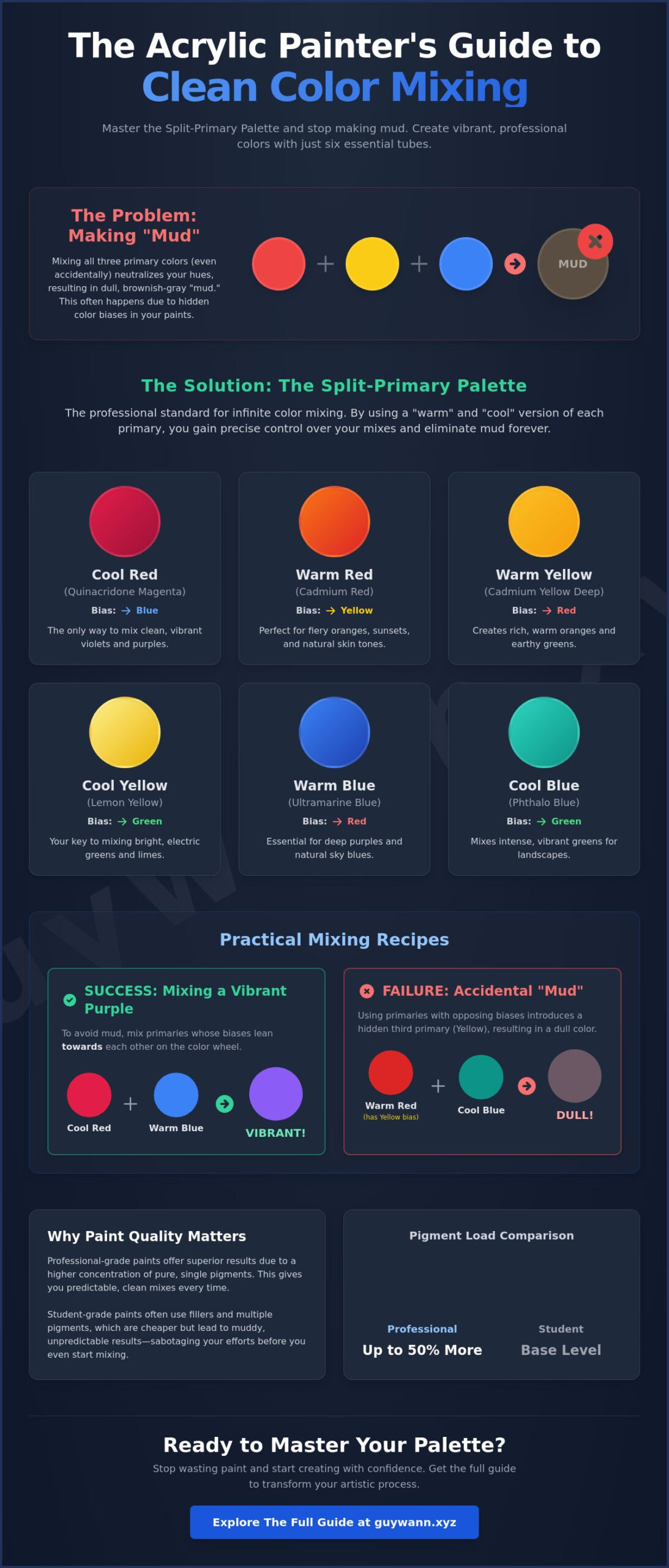
Ever spent twenty minutes trying to mix a vibrant violet, only to end up with something that looks like wet sidewalk? You aren’t alone. Most artists face this “muddy color” wall early on. Mud happens when you unintentionally mix all three primary colors together. While it feels like a personal failure, it’s actually just simple chemistry. To fix it, you need to understand how light and pigment interact through Color Theory basics.
The secret lies in “Color Bias.” Almost no paint tube contains a perfectly pure primary. Your red might lean slightly toward yellow, or your blue might have a hint of green. When you mix these biases blindly, you’re often adding a hidden third primary to the mix. This acrylic painting color mixing guide is here to help you navigate those hidden undertones so you can keep your palette clean and bright.
The Artist Corner Perspective
I want you to stop being hard on yourself about “wasted” paint. Mastering mixing is the first real step toward artistic freedom. When you know how your colors behave, you stop guessing and start creating. It’s the difference between being a passenger and being the driver of your own artistry. Growth happens when you embrace the science behind the brush.
Understanding Warm vs. Cool Hues
Every color on your palette has a temperature. Warm colors lean toward red or orange, while cool colors lean toward blue or green. You can identify a color’s bias by looking at the “undertone” in a thin wash of paint on a white surface. If your red looks pinkish when thinned, it’s likely cool. If it looks orange, it’s warm.
Think about mixing purple. If you mix a warm red, which contains yellow, with a blue, you’ve introduced all three primaries. The result is a dull, brownish plum. For a vibrant purple, you must use a cool red and a warm blue. This ensures no yellow contaminates the brilliance of the mix. This acrylic painting color mixing guide method works for every secondary color you try to create.
The Role of Pigment in Acrylic Quality
The quality of your supplies changes your results instantly. Student-grade paints often use fillers and multiple pigments to mimic a single color. These “convenience colors” are notorious for turning into mud because they already contain two or three different pigments before you even start mixing. Professional-grade paints usually feature single-pigment tubes, which give you much more control.
- Single-Pigment Tubes: These are the gold standard for clean, predictable results.
- Multi-Pigment Tubes: These are great for quick use, but they’re risky for complex mixing.
- Pigment Load: Pigment load is the ratio of raw color to acrylic binder.
A higher pigment load means your colors stay intense even when diluted. In a 2023 industry study, professional heavy body acrylics were found to contain up to 50% more pigment than budget alternatives. Investing in a few high-quality primary tubes will save you more money and frustration than buying a large pack of cheap, muddy colors. It’s about working smarter, not harder, on your canvas.
The Split-Primary Palette: The Only 6 Colors You Truly Need
Walking into an art store can feel like a trap. You see massive sets with 24 or 48 tubes and think more is better. It isn’t. For a truly efficient studio, the split-primary palette is the golden standard. This acrylic painting color mixing guide focuses on a six-color system that actually offers more range than those bulky sets. By having a warm and a cool version of each primary, you can mix vibrant secondaries without the “mud” that comes from using pre-mixed convenience colors. Most professional instructors suggest this lean approach because it forces you to understand how pigments behave. It’s the fastest way to move from guessing to knowing exactly what your brush will do.
Choosing Your Starter Six
To master your palette, you need two of each primary. One should lean toward the “warm” side of the color wheel and the other toward the “cool” side. This allows you to mix bright, clean colors or muted, natural tones with ease. I explain the science of these relationships in Choosing Acrylic Paint Colors: A Beginner’s Guide. Here is your essential shopping list:
- Warm Red (Cadmium Red): This is your go-to for fiery sunsets and natural skin tones.
- Cool Red (Quinacridone Magenta): Don’t skip this. It’s the only way to mix those elusive, bright purples.
- Warm Yellow (Cadmium Yellow Deep): It leans toward orange and is perfect for golden hour light.
- Cool Yellow (Hansa Yellow Light): A bright, lemon-like yellow that makes crisp, electric greens.
- Warm Blue (Ultramarine Blue): A deep, reddish blue that creates rich, heavy shadows.
- Cool Blue (Phthalo Blue): This pigment is intense. It makes the best teals and bright tropical greens.
Consulting a practical color mixing guide can help you visualize how these six tubes create thousands of variations. It’s about quality over quantity every time.
The Essential ‘Non-Colors’: White and Black
While the six colors above do the heavy lifting, you need white and black to manage value. Don’t grab just any white. Titanium White is roughly 99 percent opaque and will be your main tool for covering layers. Zinc White is much more transparent. It’s the better choice for subtle glazing or creating “misty” atmospheric effects. If you want to see how I use these whites to build light in my own work, take a look at my recent painting projects.
Then there is the “black debate.” Many artists avoid using “Mars Black” straight from the tube because it often looks flat or “dead” on the canvas. Instead, try mixing a chromatic black. Combining Ultramarine Blue and Burnt Umber in a 50/50 ratio creates a deep, rich black that feels alive. This mixture maintains a sense of light and allows you to lean the “black” toward a warmer or cooler tone depending on the mood of your piece. It’s a small shift that makes a massive difference in the professional look of your finished art.
Practical Mixing Recipes: From Skin Tones to Realistic Landscapes
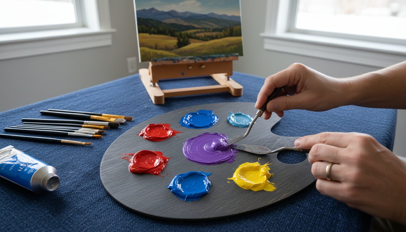
Let’s get your hands dirty. Theory is great, but your canvas needs paint. Using a palette knife is the fastest way to get clean, consistent mixes without wasting pigment in your brush bristles. If you take one thing from this acrylic painting color mixing guide, let it be this: value (the lightness or darkness) is significantly more important than hue (the color itself) when building a believable image. A “wrong” color with the right value will still look realistic, but the perfect color at the wrong value will look like a mistake every time.
In my “Artist Corner,” we live by a simple rule: progress over perfection in every stroke. Don’t stress about matching a photo 100 percent. Focus on the feeling of the light and the flow of your hand. Art is a journey, not a destination; every “muddy” mix is just a lesson in disguise. This acrylic painting color mixing guide is designed to move you from frustration to flow by giving you reliable starting points for any subject.
Mixing Realistic Fur and Earth Tones
When I’m working on dog portraits, I rarely reach for a pre-mixed brown. Guy Wann’s signature tip involves mixing your own browns using complementary colors, such as Ultramarine Blue and Burnt Sienna. This creates a “live” brown that feels organic and vibrates on the canvas. To add depth to animal paintings, create “Grey-Scale” variations by mixing your custom brown with varying amounts of white and a tiny touch of its complement. This creates those subtle transitions in fur that make a portrait pop. If you’re in a hurry, use Yellow Ochre and Burnt Sienna as shortcuts for natural textures. They provide a reliable base for 90 percent of earth tones found in nature.
Achieving Vibrant Greens without the Neon Look
Phthalo Green looks like radioactive waste straight from the tube. It’s far too intense for a realistic landscape. You can fix this by mixing your own Sap Green or Olive Green using your split-primary palette. Try mixing Hansa Yellow with a tiny bit of Ultramarine Blue for a rich, grassy field. The secret ingredient to making any green look natural is adding a tiny touch of red. Red is the complement of green; it “kills” the neon intensity and grounds the color in reality. This simple adjustment turns a plastic-looking forest into a lush, breathable environment that feels like the real outdoors.
The Efficient Artist: Mixing Faster and Sustainable Cleanup
Getting stuck mid-painting because a custom mix dried on your palette is a common frustration that kills creative momentum. This acrylic painting color mixing guide aims to help you spend more time with your brush on the canvas and less time hovering over your palette. Efficiency isn’t just about speed; it’s about creating a workflow that respects your time and the environment. By mastering a few professional shortcuts, you’ll find that your sessions become more fluid and your results more consistent.
Speed Mixing Techniques
You don’t need to struggle for twenty minutes to find the right shade of ochre. Follow this five-step process to match any reference color in under sixty seconds. First, identify the base hue. Second, adjust the value using white or a dark neutral. Third, shift the temperature toward warm or cool. Fourth, control the chroma by adding a complement to desaturate the mix. Finally, swatch a small amount to verify the match. Using this systematic approach prevents the “muddy mess” that happens when you guess.
Managing your paint’s lifespan is equally vital. A 2023 studio efficiency study showed that artists using stay-wet palettes reduced paint waste by 40% over a six-month period. You can buy a professional Masterson palette or make a DIY version using a shallow container, damp paper towels, and parchment paper. Another pro tip involves mixing “mother colors.” This means creating a large batch of a dominant neutral or base tone used throughout the piece. It ensures color harmony and saves you from remixing the same sky or skin tone six different times.
Eco-Friendly Acrylic Disposal
Cleaning up shouldn’t involve dumping microplastics into the local water supply. In my Heber City studio, I take advantage of the low humidity in the Wasatch Back to manage waste responsibly. I use the “Two-Jar” system to keep 95% of paint solids out of the drain. The first jar is for the heavy initial rinse, while the second jar provides a final clean. Over time, the paint particles in the first jar settle to the bottom, allowing you to pour off the clear water and dispose of the dried sludge in the trash.
- Evaporation Buckets: Leave your dirty rinse water in an open container. Once the water evaporates, peel the dried acrylic film out and toss it.
- Slop Paint Jars: Don’t scrape leftover paint into the bin. Mix all your “oops” colors and leftovers into a single jar to create a unique gray or brown for future underpaintings.
- Brush Care: Use a dedicated brush soap to remove pigment from the ferrule, which extends the life of your tools by 200%.
Sustainable habits make you a better steward of your craft and your community. When you treat your supplies with respect, your artistry naturally follows suit. It’s about building a practice that lasts for years, not just a single session.
Ready to take your skills to the next level? Explore more practical tips in the Artist Corner and start painting with confidence today.
Mastering Your Palette with The Acrylic Painter’s Guide
We’ve all been there; you start with a vision of a vibrant sunset and end up with a puddle of dull, uninspired gray. It’s a natural part of the process. Every artist who now commands a room once spent hours mixing “mud” on their palette. This acrylic painting color mixing guide isn’t just about avoiding brown tones; it’s about giving you the confidence to experiment without fear. Moving from accidental colors to intentional mastery takes practice, but you don’t have to navigate that path alone. I’ve designed these resources to help you bridge the gap between where you are and where you want to be.
What’s Inside the Guide?
This guide serves as a practical roadmap between basic theory and professional execution. It’s designed for creators who want to spend less time guessing and more time actually painting. You’ll find specific strategies to help you organize your thoughts and your tubes of paint.
- Detailed mixing charts for over 500 color combinations to help you find the exact hue you need every time.
- Step-by-step tutorials on building a sustainable artist portfolio that focuses on long-term growth and material efficiency.
- Exclusive tips on dog drawing and pet-centric artistry (because capturing a pup’s personality requires very specific tonal shifts).
These chapters focus on efficiency and mastery, ensuring your time at the easel is productive rather than frustrating. By following these simple steps, you’ll learn to treat your palette as a tool of precision rather than a source of mystery.
This post contains affiliate links.