
This post contains affiliate links.
Standing before a blank canvas with your palette feels amazing. Colors dance before your eyes, a sight hard to describe with words. For beginners, mixing colors might seem tough, but think of the joy in making new shades from basic ones. It’s like the whole world is in your hands.
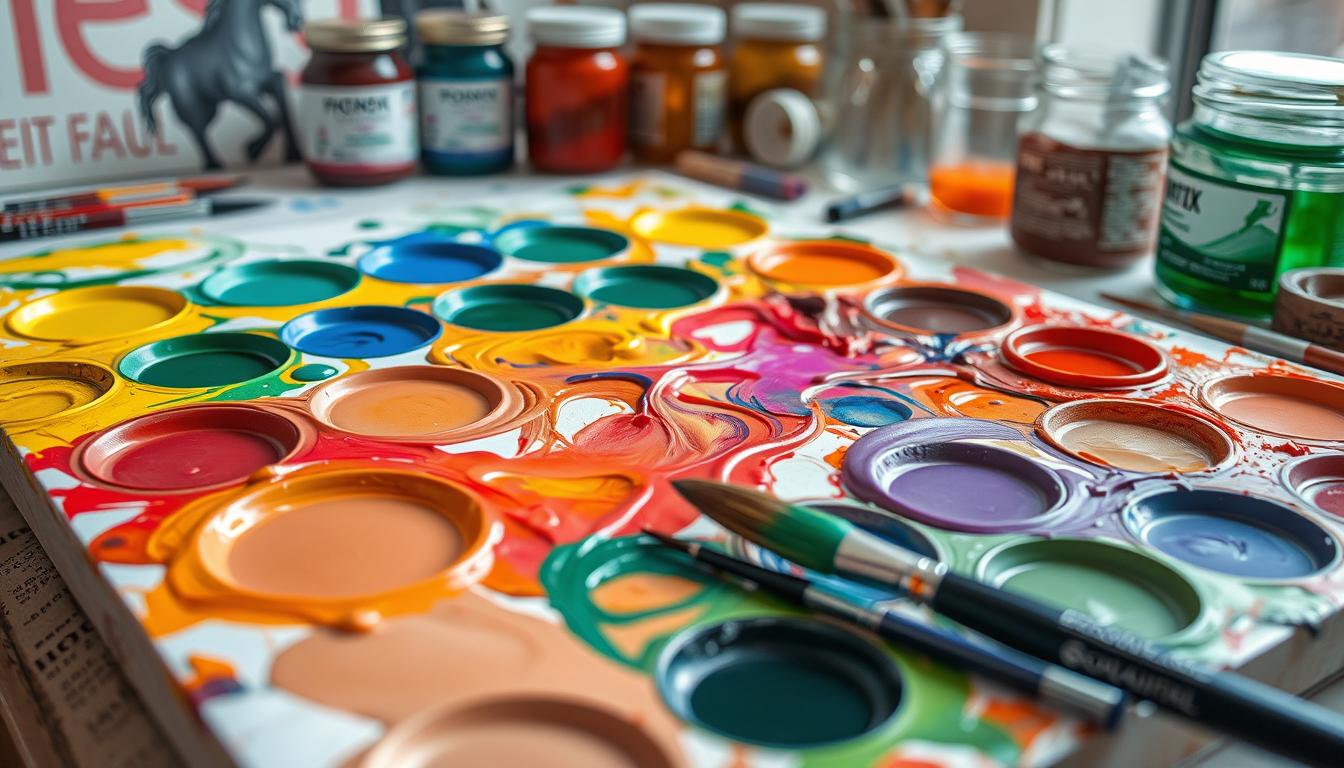
Start your acrylic painting journey by learning how to mix colors. It saves time and money and boosts creativity. The key is to understand the color wheel and how colors work together. Picture mixing the perfect shade for a sunset or the deep tones of a forest. Your adventure begins with a good acrylic color mixing tutorial for beginners.
Key Takeaways
- Understanding the basics of the color wheel and color theory.
- Differentiating between primary, secondary, and tertiary colors.
- Recognizing the significance of warm and cool colors in painting.
- Utilizing tools like a palette knife and a mixing grid for more precise color mixing.
- Avoiding common mistakes and learning practical techniques for consistent color mixing.
Mixing colors in acrylic painting is crucial. It’s not just playing around—it’s a skill that brings your artwork to life. By learning these skills, your creativity and confidence will grow.
Understanding the Basics of Color Mixing
Color mixing is crucial in acrylic painting. It lets artists try out and create many hues. By learning how to mix colors, you can explore endless possibilities and boost your creativity.
Color Wheel and Color Theory
The color wheel helps us see how colors relate. It’s a circle divided into 12 parts, showing primary, secondary, and tertiary colors. Red, yellow, and blue are the primary colors in art.
Mixing primary colors gives us secondary colors like orange, green, and violet. Mixing a primary with a nearby secondary color creates tertiary colors. This is key for mixing acrylic paint colors.
Primary, Secondary, and Tertiary Colors
Knowing the color categories on the wheel is important for acrylic painting:
- Primary Colors: Red, yellow, blue. These colors can’t be made by mixing others.
- Secondary Colors: Orange, green, violet. Made by mixing two primary colors.
- Tertiary Colors: Red-orange, yellow-orange, yellow-green, blue-green, blue-violet, red-violet. Come from mixing a primary and a secondary color.
Warm and Cool Colors
Understanding warm versus cool colors is key. Warm colors like red and yellow feel warm and active. Cool colors, such as blue and green, feel calm and peaceful. This knowledge can improve your color mixing and make your art more lively and balanced.
| Color Category | Examples | Characteristics |
|---|---|---|
| Primary Colors | Red, Yellow, Blue | Base of all other colors |
| Secondary Colors | Orange, Green, Violet | Created by mixing primary colors |
| Tertiary Colors | Red-Orange, Yellow-Green, Blue-Violet | Mixing primary with adjacent secondary color |
| Warm Colors | Red, Yellow, Orange | Evokes warmth and energy |
| Cool Colors | Blue, Green, Violet | Brings calm and tranquility |
Knowing these basics lets you experiment with color mixing in acrylic paints. This is true for all artists, whether you’re just starting or have years of experience. Learning these foundations can take your acrylic painting to the next level.
Essential Tools for Color Mixing
Acrylic painting is more than color skills; it needs the right tools. Knowing how to blend colors starts with the right materials. Let’s look at the key tools for mixing colors that elevate art.
Choosing Your Acrylic Paints
Quality is key for acrylic paints. Brands like Golden Artist Colors or Liquitex offer smooth-blending hues. Begin with primary colors and add essentials like Carbon Black and Titanium White. This mix suits both new and experienced artists, opening up many mixing possibilities.
Using a Palette Knife or Brush
Palette knives and brushes affect color mixing outcomes. A palette knife mixes thoroughly and adds texture. Brushes bring precision and are great for “Wet on Wet” to blend colors softly. Using both tools adds versatility to your painting techniques.
Importance of a Color Chart and Mixing Grid
A color chart or mixing grid helps understand color interactions. It allows easy shade replication by tracking blends. This tool is key to learning about Shades, Tints, and Tones. Knowing these aspects brings depth and harmony to art.

Using these color mixing tools will surely improve your painting. From selecting quality paints to effective tool use, and organizing a color chart, each plays a critical role in color achievement.
| Tool | Function | Recommended Brands |
|---|---|---|
| Acrylic Paints | Base medium for color mixing | Golden, Liquitex |
| Palette Knife | Efficient mixing and texture creation | Princeton, Bob Ross |
| Brushes | Precision control for painting | Winsor & Newton, Da Vinci |
| Color Chart | Reference for color mixing | DIY, Art Supply Stores |
How to Mix Colors for Acrylic Painting
Understanding how different hues interact is key to mixing acrylic paints. Start with the primary colors: red, yellow, and blue. By changing their ratios, you can create many secondary and tertiary colors. Make sure your palette includes Titanium White and Burnt Umber. They help in making highlights and shadows.
One top tip for acrylic painters is to mix colors a bit lighter than needed. This helps because acrylics get darker as they dry. Mixing primary colors in various ratios can produce many skin tones and other complex hues.
Avoid using too much black paint to darken colors. It can make the mix look muddy. Instead, use Burnt Umber or dark blue for a vibrant finish. You can also mix complementary colors like yellow and violet for rich, dark tones without the muddiness.
When mixing, use a palette knife or brush and keep your colors wet. You can use Glazing Liquid and water to keep paints moist. This allows for smoother blending. Always mix more paint than you think you’ll need. It’s hard to recreate the exact mix later on.
| Color Mixing Element | Details |
|---|---|
| Titanium White | Most frequently used for creating highlights and higher opacity in mixes. |
| Burnt Umber | Essential for creating shadows and toning down bright colors. |
| Glazing Liquid | Used in small amounts to maintain paint moisture and blendability. |
| Primary Colors (Red, Yellow, Blue) | Fundamental for mixing a wide spectrum of secondary and tertiary colors. |
Use a color wheel to find new and harmonious color schemes. This not only boosts your mixing skills but also helps you grow as an artist. Remember, practicing and experimenting are crucial for mastering color mixing in acrylic painting.
Techniques for Achieving the Perfect Color Mix
Mastering blending techniques is key to the perfect color mix with acrylics. For any artist, knowing how to blend colors in acrylic is essential. You need to grasp using white and black. You should also know how to mix complementary colors.
Using White and Black to Adjust Tone
White and black are crucial for tone adjustments in acrylic mixes. Adding white not only lightens the color; it also makes it more opaque and complex. Black, however, should be used with care to darken shades without overpowering the original color. By adjusting tone with white and black, you unlock a range of sophisticated shades.
| Color Mix | Result |
|---|---|
| Primary Yellow + Titanium White | Light orange hues |
| Primary Yellow + Fluorescent Pink | Vibrant Orange |
| Primary Yellow + Titanium White + Fluorescent Pink | Hot coral |
| Primary Yellow + Turquoise | Bright Green |
| Prussian Blue + Kelly Green | Deep Teal |
| Quinacridone Magenta + Titanium White | Light Lavender |
Mixing Complementary Colors
Mixing acrylic paints well requires using complementary colors. These colors, like yellow and violet, sit opposite on the color wheel. Mixing them produces rich, natural shades for shadows and depth. This technique creates muted, complex nuances for a sophisticated look.

Mixing opposing colors unlocks creative potential for dynamic artworks. Mastering this will greatly improve your acrylic paint mixing skills.
Common Mistakes and How to Avoid Them
Acrylic painting is fun and quick, but it has its challenges. Knowing the risks with color mixing pitfalls and avoiding mixing mistakes in acrylic painting boosts your art.
The rapid drying time of acrylics is a double-edged sword. Don’t overwork the paint to dodge unwanted blending. Layer it bit by bit instead.
Here are a few common slip-ups and their fixes:
- Muddying Colors: Too many colors together can look dull and muddy. Start with a few colors and add more as you go.
- Over-Mixing: Blending colors too much can wash out the nuances. Aim for a mix that keeps colors bright.
- Ignorance of Darkening Effect: Acrylics get darker as they dry. Test your colors and lighten them to get the desired outcome.
Fixing errors is doable even after the paint dries. Rub off dried paint with denatured alcohol and a paper towel. To cover big mistakes, use artist-grade titanium white.
For reusing canvases, you’ll need several coats of quality paint or Gesso for a smooth base. But too much painting can make canvases less absorbent, affecting some methods.
Beginners often use too much water or don’t wait long enough between layers. This can lead to smearing. Also, overthinking color mixing can block 80% of new acrylic artists’ creativity.
| Issue | Solution |
|---|---|
| Using Too Much Water | Opt for proper acrylic mediums or high-quality paints instead. |
| Insufficient Drying Time | Wait for each layer to dry completely before the next. |
| Overworking Paint | Paint in small areas quickly and don’t redo sections. |
| Leaving Brushes in Water | Clean your brushes right away with warm water and soap. |
Lastly, trying different techniques, brushes, and colors helps you grow. Acrylic painting allows for mistakes, so experiment and learn with each brushstroke!
Creating Depth and Shadows in Your Painting
Learning to add depth with shadows in acrylic painting makes your work more realistic and interesting. It’s all about understanding acrylic layering for depth and using colors effectively. With these skills, your paintings will look three-dimensional.
Mixing Shadow Colors
When you mix shadow colors, think about where the light comes from. Use complementary colors to darken shades and add depth. For example, burnt umber and nutmeg are good for shadow tones. Experimenting with these colors on a mixed media pad teaches you how they layer. Avoiding black makes shadows look more real.
Layering Techniques
Creating depth in acrylics means adding color layers from light to dark. The cranked handle palette knife by RGM helps with this. Start with a base of Yellow Ochre and Cadmium Yellow Light. Then, use a Rosemary & Co Ivory filbert brush for forms and shadows. Getting the edges right matters for realistic shadows.
“Practicing shading and highlighting techniques is essential for creating dimension in your paintings. A mixed media pad is perfect for this exercise.”
| Materials | Purpose |
|---|---|
| Mixed Media Pad | Practice mixing and layering colors |
| Burnt Umber, Nutmeg, and Raw Umber | Creating dark values and shadows |
| Yellow Ochre, Cadmium Yellow Light | Applying initial color ground |
| Cranked Handle Palette knife | Layering and texturing techniques |
| Rosemary & Co Ivory Filbert Brush | Drawing and defining shadows |
Using these methods and tools will elevate the depth and texture in your acrylic paintings. Experimenting with colors brings out lifelike shadows and dimensions in your artwork.
Practical Tips for Consistent Color Mixing
Pay close attention to color mixing techniques to make vibrant and cohesive art. Use organized methods and systematic steps. Doing this helps artists create the look they want in their work.
Keeping a Record of Color Mixes
Recording your color mixes is a smart way to keep your color mixing consistent. It lets you recreate specific shades and hues in different projects. This ensures everything matches. Keeping a color chart or journal is very helpful. For example, knowing the mixing behaviors of #109 Carbon Black or #118 Titanium White can save time. Check out the exercise on creating tints, tones for more tips on color mixing.
Testing Colors Before Application
It’s important to test acrylic colors before using them. This avoids unexpected results, as they can change when dry. Adding testing stages to your process lets you fine-tune before larger applications. Try colors like #187 Pyrrole Red or #123 Cadmium Yellow Light on a small area first.
Here’s a guide to some recommended colors:
| Color Name | Hex Code | Brand Recommendation |
|---|---|---|
| Carbon Black | #109 | Master’s Touch |
| Titanium White | #118 | Master’s Touch |
| Pyrrole Red | #187 | Artist’s Loft |
| Cadmium Yellow Light | #123 | Liquitex Basics |
| Phthalo Green | #116 | Artist’s Loft |
Use these structured practices to make your artwork look better together. Explore more at acrylic painting tutorials for beginner tips on materials and methods.
Enhancing Your Painting with Unique Color Combinations
For any artist, exploring unique color combos is key to enhancing acrylic paintings. By experimenting with different colors, artists create captivating visual effects. These effects draw in your audience.
Exploring Analogous Colors
Analogous colors sit close on the color wheel, bringing harmony and beauty. Mixing GREEN with Phthalo Blue, or Hansa Yellow Opaque with Quinacridone Magenta, makes vibrant blends. These combinations boost your artwork’s depth and mood.
Creating Harmonious Blends
Trying different blending ratios is useful. The GOLDEN mix set has eight pro acrylic colors for a wide range. With its colors, you get to invent fresh, unheard-of color mixes. To make bright greens, mix 1 part Phthalo Green with 9 parts Hansa Yellow Medium. Adding Titanium White can help cover more space, especially with see-through colors.
These techniques deepen color interaction knowledge. Keeping a sketchbook of successful mixes helps repeat these colors in future work. This leads to more consistent, striking pieces.
| Color | Mixing Ratios | Resulting Colors |
|---|---|---|
| Phthalo Blue & Phthalo Green | Equal parts | Turquoise |
| Phthalo Green & Hansa Yellow Medium | 1:9 | Bright Green |
| Phthalo Green & Naphthol Red Light | Equal parts | Black (low-chroma) |
| Hansa Yellow Opaque & Phthalo Pigments | Variable | Balanced Tint Strength |
Mixing colors right lets artists craft more dynamic, real scenes. Whether you need lush greens for forests or soft browns for rocks, mastering these blends improves your art. It enriches your creative toolkit and makes your acrylic paintings stand out.
Conclusion
Our guide has shown you how to mix acrylic paint colors. This knowledge boosts creativity and skills for new artists. You’ve learned about the color wheel and different color types. You now understand the importance of warm and cool colors too.
Tools like palette knives, brushes, and color charts make mixing easy and fun. Through pre and free mixing, you can create amazing art. Using white and black adjusts tones, while complementary colors add beauty. For skies or waters, try the Wet on Wet technique.
Doing exercises like the Pure Value Study helps you grasp shades and tones better. This leads to more balanced art. Remember to keep an organized palette and use technology for color matching. For more help, check out this step-by-step guide. Mastering these skills enriches your art, making the journey enjoyable.
FAQ
What are the primary colors in acrylic painting?
How does the color wheel help in color mixing?
What’s the difference between warm and cool colors?
Which tools are essential for mixing acrylic paints?
How can I create shadows in my acrylic painting?
What are common mistakes in color mixing, and how can I avoid them?
How do I use white and black effectively in color mixing?
How can I achieve consistency in color mixing?
What are analogous colors, and how can they enhance my painting?
Why is creating a color chart important?
This post contains affiliate links.